Modding:GUIs
This page was last verified for Vintage Story version 1.19.8.
Creating good graphical user interfaces is a challenging task - sometimes even the largest of companies mess it up.
In Vintage Story you currently need to formulate your GUIs in code, which requires acute spacial thinking. Hopefully someday we'll have a point&click GUI designer that takes off a lot of work. Until then, here are some of the essentials.
Dialog Outline Modes
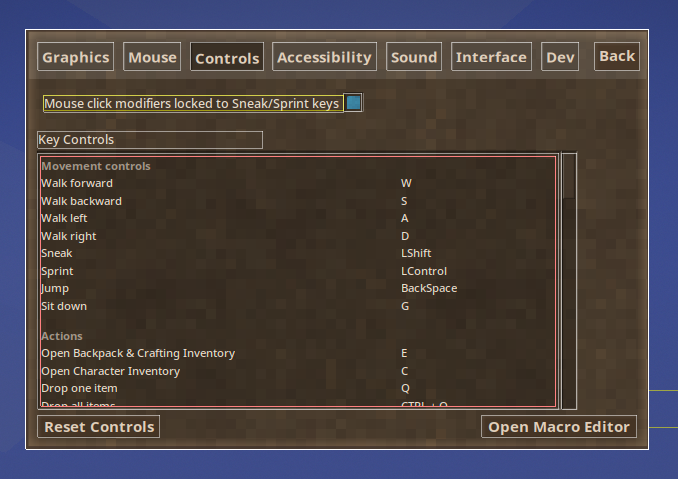
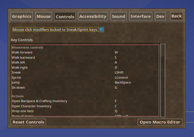
The Cycle Dialog Outline Modes keybinding can be used to add outlines around GUI elements, making it much easier to understand how your code is translated into the visual GUI. Pressing the key cycles between the 3 modes. By default the key is bound to Alt + F10, but on some Linux distros it may need to be rebound.
Mode 0: No Outlines
This is the default mode when the game is started. The GUI elements are shown, but no outline rectangles are drawn.
Mode 1: Element and Composer Outlines
In addition to the mode 2 rectangles around GuiElements (explained below), bold white rectangles are drawn around GuiComposers.
Mode 2: Element Outlines
The bounding boxes of GuiElements are drawn as rectangles. The rectangle color is determined by the possibly overridden implementation of GuiElement.OutlineColor, which returns a color in 0xAARRGGBB format.
| Class | Color |
|---|---|
| GuiElementHoverText | yellow - 0x80FFFF00 |
| GuiElementItemSlotGridBase | bold green - 0xFF00FF00 |
| GuiElementClip | bold red - 0xFFFF0000 |
| GuiElement | white - 0x80FFFFFF |
GUI Base Classes
You should encapsulate every GUI Dialog into its own class, albeit a dialog may consist of multiple windows - the vanilla character dialog for example has two - one for the players wearables and one for the player stats. There's a couple of base classes to make your life a bit easier.
Block Entity GUI
To create a GUI that's bound to a block entity, inherit from GuiDialogBlockEntity. In your block entity code you can then create and open that gui e.g. upon player interaction (example: Quern Block Entity, Quern Block Dialog)
HUD
To create a GUI element which is not interactable, inherit from HudElement.
General Purpose GUI
For any other uses, inerhit from the general purpose class GuiDialog, from which HudElement and GuiDialogBlockEntity also inherit from. You can override ToggleKeyCombinationCode to something like "yourAweseomeHotkeyCode" and use capi.Input.RegisterHotKey + capi.Input.SetHotKeyHandler to have your own keyboard key mapped to opening/closing your GUI (example: World Map)
ElementBounds
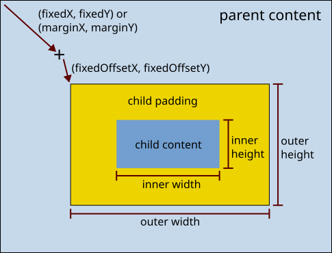
An ElementBounds instance describes the several bounding boxes and offsets of a GuiElement, which are summarized in the diagram below. For fixed alignments, (fixedX, fixedY) is the vector from the top-left corner of the parent element's content box to the top-left corner of the child element's offset point. For auto alignments, (marginX, marginY) is used instead (technically (absMarginX, absMarginY)). After that comes another offset vector called (fixedOffsetX, fixedOffsetY) which points to the top left corner of the child padding box. Inside of the padding box is the content box. The inner width/height only contains the content. The outer width/height contains the content and padding.
The fields in ElementBounds with the 'abs' prefix should be treated as internal fields. They are written by ElementBounds.CalcWorldBounds. However, these other fields may be set either directly or with helper methods.
| Fields | Primary setters | Purpose |
|---|---|---|
| fixedX/fixedY |
|
The offset of the child padding top-left corner relative to the parent content top-left corner. These are the main fields used to place GUI elements. These fields should only be set if the corresponding x/y dimension has a fixed sizing and alignment mode. |
| fixedWidth/fixedHeight |
|
The size of the element content. These fields should only be used when the corresponding dimension is in the ElementSizing.Fixed or ElementSizing.PercentualSubstractFixed mode. |
| fixedPaddingX/fixedPaddingY |
|
The amount of empty space to put around the element |
| fixedMarginX/fixedMarginY |
|
These fields are never read by Vanilla VS. The corresponding absMarginX/absMarginY are internally calculated based on the alignment mode, but those calculations ignore fixedMarginX/fixedMarginY. |
| ParentBounds/ChildBounds |
|
Tracks the parent/child relation between elements |
| Alignment |
|
The alignment of the element. If set to None the FixedX/Y Position is used. For any other value, the FixedX/Y values break the layout. For example when you used RightTop the element will always be at the right top most corner of its parent bounds. If you use RightFixed the element will be right aligned, but its Y-Position is determined by FixedY
|
| horizontalSizing/verticalSizing |
|
The sizing method to be used, can be either Fixed (default), Percentual or FitToChildren
|
Layout
Compared to the CSS flow layout algorithm, the GuiComposer layout algorithm is very primitive.
Alignment
The alignment option can automatically place a child element in any of the 4 corners or 4 edges of the parent. However, the alignment algorithm does nothing to prevent two child elements from overlapping on the same edge/corner. For example, if two text boxes were added to the bottom edge of a dialog, then the two pieces of text would overlap. There are a few options to fix the conflict:
- Use different edges or corners for the two pieces of text.
- Use
.WithFixedAlignmentOffset(0, -10)to move one of the children up 10 pixels (relative to the bottom alignment in this example). - Give up on automatic alignment and used fixed alignment instead, where the child coordinates must be calculated exactly relative to the top-left corner of the parent content box.
Typically one uses fixed alignment to layout the dialog. The functions BelowCopy and RightCopy help calculate the bounds next to the previous bounds.
Sizing
ElementSizing.FitToChildren tells a parent to automatically size itself so that it contains the bottom-right corner of the padding box for all of its children. Note that unlike the HTML flow layout, the VS layout does not prevent the children from overlapping. So the sizing algorithm is more or less sizing the parent to fit its largest child.
GUI Basics
In general, you can pretty much build your own GUI system if you want to, by just overriding OnRenderGUI and render whatever you like. There's a multitude of overridable methods to handle mouse and keyboard inputs as well, see also the GuiDialog class on Github
If you want to use the vanilla GUI system, it's concept is merely a flat or hierarchical list of GUI elements placed at certain positions. The position is determined by an instance of ElementBounds. Let's have a closer look at it's properties:
ElementBounds
GuiComposer
This is the component that builds and manages your GUI elements for you. You can create a composer via the client api: capi.Gui.CreateCompo(dialogName, bounds). You have to supply it with a unique identifier and the overall dialog bounds. Once you have a GUIComposer instance you can chain-add elements.
Dialog / Graphics
.AddShadedDialogBG: Draws a pretty background and dialog border.AddDialogTitleBar: Draws a title bar with a close button and a button to move around the dialog.AddInset: Adds a darkened section with a inset border around it
Text
.AddStaticText: Add a static snippet of text.AddDynamicText: Add a snippet of text that can be set to other texts without the need to redraw the whole dialog.AddRichtext: Same as.AddDynamicTextbut allows use of VTML - a minimalist version of HTML code.AddHoverText: When the mouse cursor moves over the element boundaries, will show supplied text as a tooltip
UI Control/Input
.AddButton: Adds a clickable button.AddDropDown: Adds a drop down element.AddHorizontalTabs: Adds horizontally aligned tabs, like the ingame chat window has.AddVerticalScrollbar: Adds a vertical scrollbar.AddTextInput: Adds an single line editable text field.AddNumberInput: Adds an editable text field built for entering numbers.AddTextArea: Adds multiple line editable text field
Tables/Grids/Inventory
.AddItemSlotGrid: Create a grid displaying the contents of supplied inventory (example: GuiDialogCreatureContents).AddSkillItemGrid: Create a grid of custom elements (example: GuiDialogBlockEntityRecipeSelector)
Other
.AddIf/.EndIf: Can be used to conditionally add certain elements (but you can also just split up your creation code for more fine grained control).BeginClip/.EndClip: Used in combination with a scrollbar to cut away oversized content, such as in the creative inventory.AddStaticCustomDraw: Lets you define your own drawing code to be added to the GUI
GuiElements
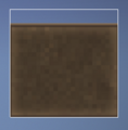
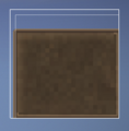
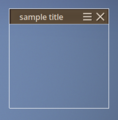
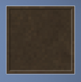
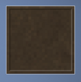
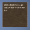
To better show what is rendered by the GuiElements, the screenshots shown below were taken with dialog outlines enabled.
GuiElementDialogBackground
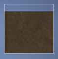
Draws a pretty background and dialog border. The background is drawn on both the padding and content boxes. Typically one uses ElementBounds.Fill (with padding optionally set) to set the background for the entire dialog. Although it is technically possible to use smaller bounds. The withTitleBar does not actually draw the title bar, but instead moves the top of the background box down GuiStyle.TitleBarHeight units to make room for the title bar.
GuiComposer factory functions:
.AddShadedDialogBG(ElementBounds bounds, bool withTitleBar = true, double strokeWidth = 5.0, float alpha = 0.75f).AddDialogBG(ElementBounds bounds, bool withTitleBar = true, float alpha = 1f)
GuiElementDialogTitleBar
Draws a title bar with a close button and a button to move around the dialog. The drawBg option is ignored.
GuiComposer factory functions:
.AddDialogTitleBar(string text, Action onClose = null, CairoFont font = null, ElementBounds bounds = null): The default null for the bounds will put the title bar in the correct place. The default title bar height isGuiStyle.TitleBarHeight.
GuiElementInset
Adds a darkened section with a inset border around it.
GuiComposer factory functions:
.AddInset(string text, ElementBounds bounds, int depth = 4, float brightness = 0.85f)
GuiElementStaticText
Add a static snippet of text.
GuiComposer factory functions:
.AddStaticText(string text, CairoFont font, ElementBounds bounds, string key = null).AddStaticText(string text, CairoFont font, EnumTextOrientation orientation, ElementBounds bounds, string key = null).AddStaticTextAutoBoxSize(string text, CairoFont font, EnumTextOrientation orientation, ElementBounds bounds, string key = null): adds text and resizes the bounding box such that the text fits on one line. Since the bounds are updated immediately, this may be useful for adding additional components to the right of the text. After callingAddStaticTextAutoBoxSize, one could usenewbounds.FixedRightOf(textbounds),newbounds.RightOf(textbounds), ortextbounds.RightCopy()..AddStaticTextAutoFontSize(string text, string text, CairoFont font, ElementBounds bounds, string key = null): attempts to shrink the font size such that the text fits in one line inbounds.
The standard fonts can be obtained through static factory methods inside of CairoFont. These are commonly used:
CairoFont.WhiteSmallText()CairoFont.WhiteDetailText()
The text orientation would more accurately be called the text justification. It defaults to the font's justification, which is typically left. The options are:
LeftRightCenterJustify: does the same thing as Left.
The key option is used to find the static text later with GuiElementStaticText.GetStaticText(SingleComposer, key).
Example
First iteration: basic static text
private void SetupDialog()
{
    // Auto-sized dialog at the center of the screen
    ElementBounds dialogBounds = ElementStdBounds.AutosizedMainDialog.WithAlignment(EnumDialogArea.CenterMiddle);

    // Just a simple 300x300 pixel box
    ElementBounds textBounds = ElementBounds.Fixed(0, 0, 300, 300);

    SingleComposer = capi.Gui.CreateCompo("myAwesomeDialog", dialogBounds)
        .AddStaticText("This is a piece of text at the center of your screen - Enjoy!", CairoFont.WhiteDetailText(), textBounds)
        .Compose()
    ;
}
Some explanations:
ElementStdBounds: Contains a bunch of often used element bounds configurations. See also ElementStdBounds on Github.ElementBounds.Fixed(0, 0, 300, 300): Create a new bounds instance with fixedX/Y at 0/0 and a fixed widt/height of 300/300 pixels.CairoFont.WhiteDetailText(): Create a new font configuration based on a often used size and color, in this case white with font size 14SingleComposer: This property is defined in theGuiDialogclass. Its a getter/setter to theComposersdictionary. It contains all the "windows" of this dialog which are then rendered / handled by this GuiDialog instance
Second iteration: add title bar
This is of course the absolute minimum example that will only show some text. Let's add a title bar and a dialog background:
private void SetupDialog()
{
    // Auto-sized dialog at the center of the screen
    ElementBounds dialogBounds = ElementStdBounds.AutosizedMainDialog.WithAlignment(EnumDialogArea.CenterMiddle);

    // Just a simple 300x100 pixel box with 40 pixels top spacing for the title bar
    ElementBounds textBounds = ElementBounds.Fixed(0, 40, 300, 100);

    // Background boundaries. Again, just make it fit it's child elements, then add the text as a child element
    ElementBounds bgBounds = ElementBounds.Fill.WithFixedPadding(GuiStyle.ElementToDialogPadding);
    bgBounds.BothSizing = ElementSizing.FitToChildren;
    bgBounds.WithChildren(textBounds);

    SingleComposer = capi.Gui.CreateCompo("myAwesomeDialog", dialogBounds)
        .AddShadedDialogBG(bgBounds)
        .AddDialogTitleBar("Heck yeah!", OnTitleBarCloseClicked)
        .AddStaticText("This is a piece of text at the center of your screen - Enjoy!", CairoFont.WhiteDetailText(), textBounds)
        .Compose()
    ;
}

private void OnTitleBarCloseClicked()
{
    TryClose();
}
Final iteration: connect to hot key
A simple standard dialog, triggered by the keyboard key 'U'
public class GuiDialogAnnoyingText : GuiDialog
{
    public override string ToggleKeyCombinationCode => "annoyingtextgui";

    public GuiDialogAnnoyingText(ICoreClientAPI capi) : base(capi)
    {
        SetupDialog();
    }

    private void SetupDialog()
    {
        // Auto-sized dialog at the center of the screen
        ElementBounds dialogBounds = ElementStdBounds.AutosizedMainDialog.WithAlignment(EnumDialogArea.CenterMiddle);

        // Just a simple 300x300 pixel box
        ElementBounds textBounds = ElementBounds.Fixed(0, 40, 300, 100);

        // Background boundaries. Again, just make it fit it's child elements, then add the text as a child element
        ElementBounds bgBounds = ElementBounds.Fill.WithFixedPadding(GuiStyle.ElementToDialogPadding);
        bgBounds.BothSizing = ElementSizing.FitToChildren;
        bgBounds.WithChildren(textBounds);

        // Lastly, create the dialog
        SingleComposer = capi.Gui.CreateCompo("myAwesomeDialog", dialogBounds)
            .AddShadedDialogBG(bgBounds)
            .AddDialogTitleBar("Heck yeah!", OnTitleBarCloseClicked)
            .AddStaticText("This is a piece of text at the center of your screen - Enjoy!", CairoFont.WhiteDetailText(), textBounds)
            .Compose()
        ;
    }

    private void OnTitleBarCloseClicked()
    {
        TryClose();
    }
}

public class AnnoyingTextSystem : ModSystem
{
    ICoreClientAPI capi;
    GuiDialog dialog;

    public override bool ShouldLoad(EnumAppSide forSide)
    {
        return forSide == EnumAppSide.Client;
    }

    public override void StartClientSide(ICoreClientAPI api)
    {
        base.StartClientSide(api);

        dialog = new GuiDialogAnnoyingText(api);

        capi = api;
        capi.Input.RegisterHotKey("annoyingtextgui", "Annoys you with annoyingly centered text", GlKeys.U, HotkeyType.GUIOrOtherControls);
        capi.Input.SetHotKeyHandler("annoyingtextgui", ToggleGui);
    }

    private bool ToggleGui(KeyCombination comb)
    {
        if (dialog.IsOpened()) dialog.TryClose();
        else dialog.TryOpen();

        return true;
    }
}
Example - Scrolling
A scrolling GUI requires:
- A clip area where the scrolling content will appear (BeginClip / EndClip)
- The scrollbar itself (AddVerticalScrollbar in the example below)
- A call to GuiElementScrollbar.SetHeights() after the GUI dialog has been composed
Here is a straightforward example of a scrolling GUI.
    public class DemoScrollingGui : GuiDialog
    {
        public override string ToggleKeyCombinationCode => "demoscrollgui";

        public DemoScrollingGui(ICoreClientAPI capi) : base(capi)
        {
            SetupDialog();
        }

        private void SetupDialog()
        {
            int insetWidth = 900;
            int insetHeight = 300;
            int insetDepth = 3;
            int rowHeight = 35;
            int rowCount = 40;

            // Auto-sized dialog at the center of the screen
            ElementBounds dialogBounds = ElementStdBounds.AutosizedMainDialog.WithAlignment(EnumDialogArea.CenterMiddle);

            // Bounds of main inset for scrolling content in the GUI
            ElementBounds insetBounds = ElementBounds.Fixed(0, GuiStyle.TitleBarHeight, insetWidth, insetHeight);
            ElementBounds scrollbarBounds = insetBounds.RightCopy().WithFixedWidth(20);

            // Create child elements bounds for within the inset
            ElementBounds clipBounds = insetBounds.ForkContainingChild(GuiStyle.HalfPadding, GuiStyle.HalfPadding, GuiStyle.HalfPadding, GuiStyle.HalfPadding);
            ElementBounds containerBounds = insetBounds.ForkContainingChild(GuiStyle.HalfPadding, GuiStyle.HalfPadding, GuiStyle.HalfPadding, GuiStyle.HalfPadding);
            ElementBounds containerRowBounds = ElementBounds.Fixed(0, 0, insetWidth, rowHeight);

            // Dialog background bounds
            ElementBounds bgBounds = ElementBounds.Fill
                .WithFixedPadding(GuiStyle.ElementToDialogPadding)
                .WithSizing(ElementSizing.FitToChildren)
                .WithChildren(insetBounds, scrollbarBounds);

            // Create the dialog
            SingleComposer = capi.Gui.CreateCompo("demoScrollGui", dialogBounds)
                .AddShadedDialogBG(bgBounds)
                .AddDialogTitleBar("Scroll Me!", OnTitleBarCloseClicked)
                .BeginChildElements()
                    .AddInset(insetBounds, insetDepth)
                    .BeginClip(clipBounds)
                        .AddContainer(containerBounds, "scroll-content")
                    .EndClip()
                    .AddVerticalScrollbar(OnNewScrollbarValue, scrollbarBounds, "scrollbar")
                .EndChildElements();

            // Add desired scrollable content to the container
            GuiElementContainer scrollArea = SingleComposer.GetContainer("scroll-content");
            for (int i = 0; i < rowCount; i++)
            {
                scrollArea.Add(new GuiElementStaticText(capi, $"- Example Row {i+1} -", EnumTextOrientation.Center, containerRowBounds, CairoFont.WhiteSmallishText()));
                containerRowBounds = containerRowBounds.BelowCopy();
            }

            // Compose the dialog
            SingleComposer.Compose();

            // After composing dialog, need to set the scrolling area heights to enable scroll behavior
            float scrollVisibleHeight = (float)clipBounds.fixedHeight;
            float scrollTotalHeight = rowHeight * rowCount;
            SingleComposer.GetScrollbar("scrollbar").SetHeights(scrollVisibleHeight, scrollTotalHeight);

        }

        private void OnNewScrollbarValue(float value)
        {
            ElementBounds bounds = SingleComposer.GetContainer("scroll-content").Bounds;
            bounds.fixedY = 5 - value;
            bounds.CalcWorldBounds();
        }

        private void OnTitleBarCloseClicked()
        {
            TryClose();
        }
    }
| Code Modding | |||||||
|---|---|---|---|---|---|---|---|
| Basics | Code Mods • Preparing For Code Mods • Creating A Code Mod | ||||||
| Tutorials |
|
||||||
| Advanced | Server-Client Considerations • Setting up your Development Environment • Advanced Blocks • Advanced Items • Block and Item Interactions • Block Behavior • Block Entity • Particle Effects • World Access • Inventory Handling • Commands • GUIs • Network API • Monkey patching (Harmony) | ||||||
| Data Management | VCDBS format • Savegame Moddata • ModConfig File • Chunk Moddata • Serialization Formats • TreeAttribute | ||||||
| Worldgen | WorldGen API • NatFloat • EvolvingNatFloat | ||||||
| Rendering | Shaders and Renderers | ||||||
Wondering where some links have gone?
The modding navbox is going through some changes! Check out Navigation Box Updates for more info and help finding specific pages.
| Modding | |
|---|---|
| Modding Introduction | Getting Started • Theme Pack |
| Content Modding | Content Mods • Developing a Content Mod • Basic Tutorials • Intermediate Tutorials • Advanced Tutorials • Content Mod Concepts |
| Code Modding | Code Mods • Setting up your Development Environment |
| Property Overview | Item • Entity • Entity Behaviors • Block • Block Behaviors • Block Classes • Block Entities • Block Entity Behaviors • Collectible Behaviors • World properties |
| Workflows & Infrastructure | Modding Efficiency Tips • Mod-engine compatibility • Mod Extensibility • VS Engine |
| Additional Resources | Community Resources • Modding API Updates • Programming Languages • List of server commands • List of client commands • Client startup parameters • Server startup parameters Example Mods • API Docs • GitHub Repository |
